01 The brief
Visidex needed an identity that would survive being shrunk. Operations and records tooling lives in browser tabs, favicons and email signatures — places where a detailed mark disappears and an accent colour turns to mud.
02 What we made
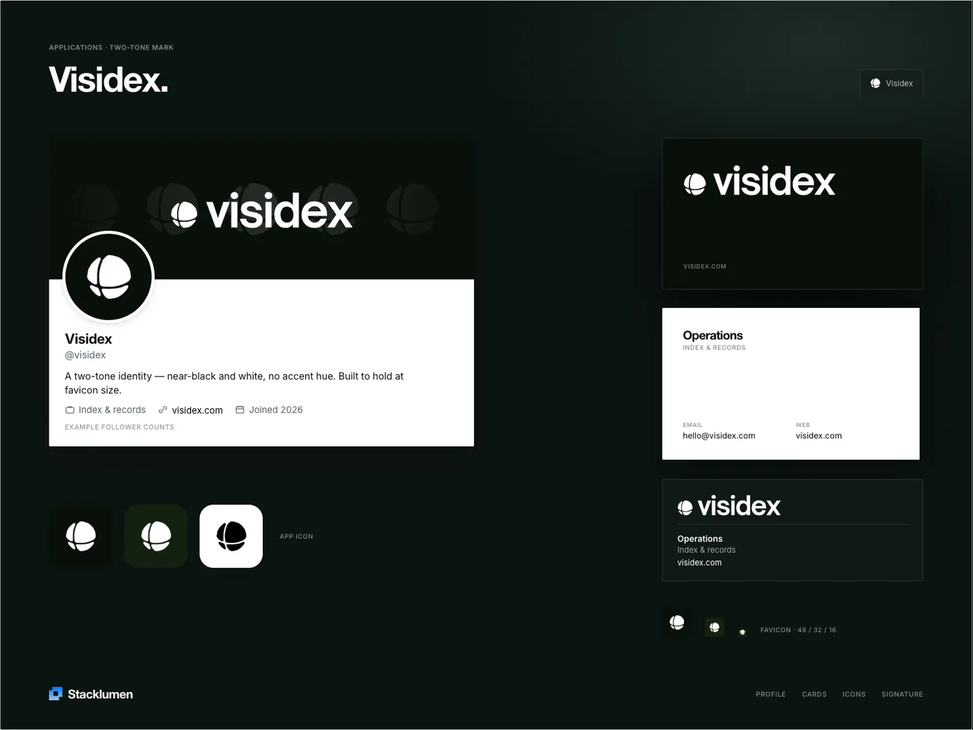
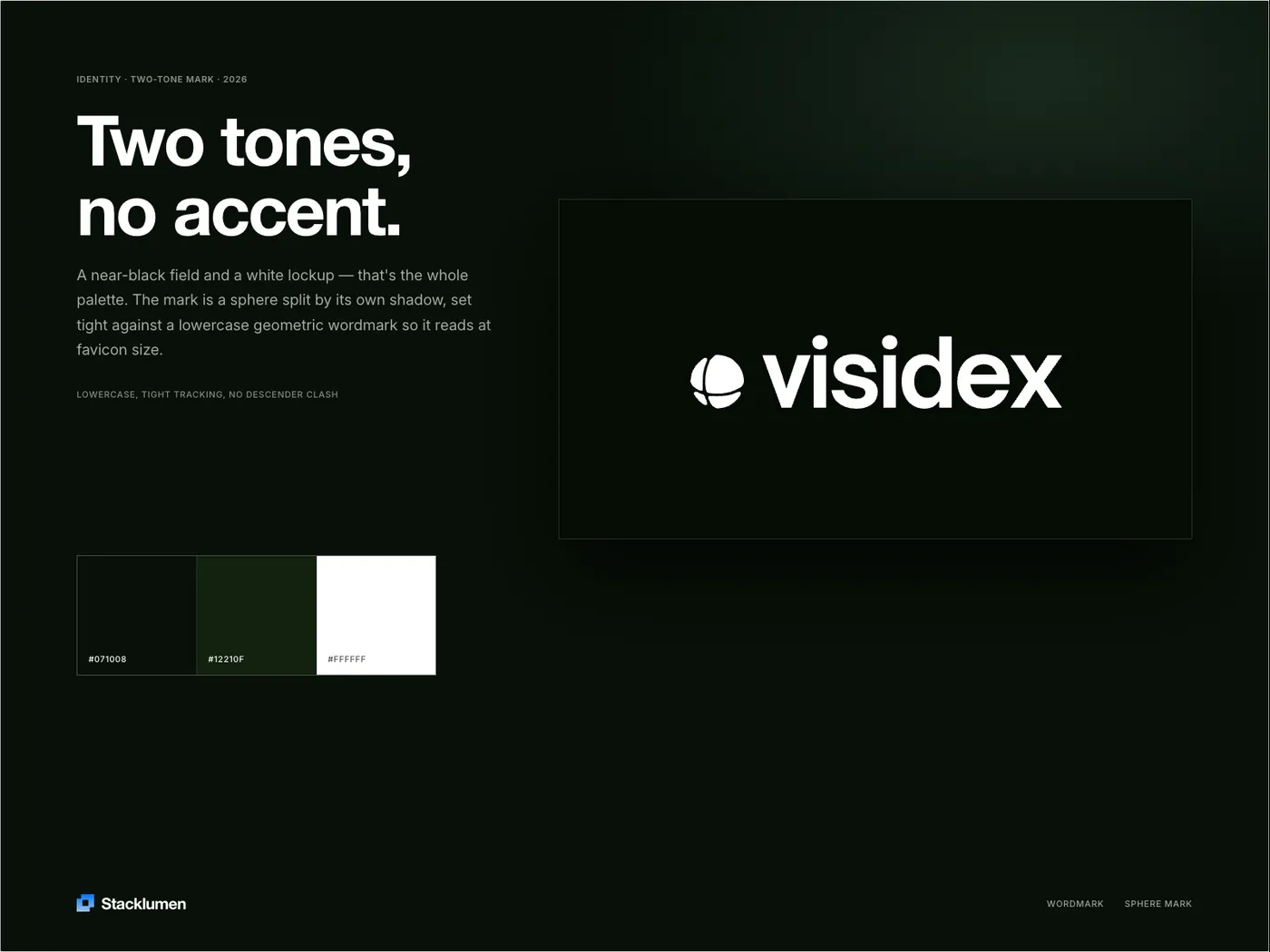
A two-tone system: a near-black field, a white lockup, and no accent hue at all. The mark is a sphere split by its own shadow, set tight against a lowercase geometric wordmark so the two read as a single shape at favicon size.
The palette is three values — #071008, #12210F and white — and every applied surface is drawn from that one lockup rather than redrawn per format, so the cards, the signature block and the app icon are recognisably the same object.
✦ Deliverables
- Sphere mark, lowercase wordmark and lockup rules
- Three-value palette: #071008, #12210F, #FFFFFF
- App icon set and favicons at 48 / 32 / 16
- Business cards and email signature
- Profile and social header artwork
◳ In application