"Clean" is not a visual style
Ask ten people what a clean website looks like and you will get ten descriptions of the same thing: lots of white space, a restrained palette, generous type. That description is not wrong, but it mistakes the symptom for the cause. White space is cheap. Anyone can add padding.
What people are actually responding to is structural coherence — the sense that decisions were made once and applied consistently, that the thing was built rather than assembled. Clean is what a well-organised system looks like from the outside. You cannot fake it with padding, because the moment a visitor scrolls to the second section, an improvised site reveals itself: the spacing changes, the buttons disagree, the type scale wobbles.
This matters commercially, and there is a substantial research literature explaining why.
The judgment happens before anyone reads a word
In a series of studies at Carleton University, Lindgaard and colleagues asked participants to rate the visual appeal of web pages shown for just 500 milliseconds. Then they cut the exposure to 50 milliseconds — a twentieth of a second, well below the threshold of considered thought. The ratings from the 50ms condition correlated closely with those from the longer exposure, and were highly stable across repeated trials.1
Fifty milliseconds is not enough time to read a headline. It is barely enough to register a layout. Whatever is being judged in that window is not your value proposition — it is coherence, contrast, density, and balance.
The Stanford Web Credibility Project put numbers on the consequence. In a study where 2,684 participants evaluated live websites and explained their reasoning, the single most commonly cited factor in credibility assessments was "design look" — layout, typography, white space, images, colour — mentioned in 46.1% of comments. It outranked information structure, information focus, company motive, and the usefulness of the content itself.2
The uncomfortable implication for anyone who has ever said "the content is what matters" is that content only gets evaluated by people who stayed.
Design gets you past rejection; substance earns selection
The most useful finding in this literature is also the most frequently misquoted. It comes from Sillence and colleagues, who observed fifteen women researching a genuinely consequential health decision over four consecutive weeks and analysed how they talked about the sites they encountered.3
What emerged was a staged model of trust rather than a single verdict. In the first stage, visitors rapidly discard. That rejection is driven overwhelmingly by design appeal — poor visual design predicted mistrust and elimination. But among the sites that survived, design was not what earned commitment. Selection was predicted by the credibility of the information and the degree to which the content felt personalised to the reader's situation.
Two different mechanisms, two different stages. This explains why beautiful sites with nothing to say still fail, and why substantive businesses with dated sites never get the chance to make their case. Design does not persuade anyone to buy. It buys you the right to be considered.
Which means clean design is best understood not as decoration but as a filter you have to pass through before your actual argument is heard.
What clean looks like in practice
Four structural properties produce the effect. None of them is a style choice.
1. Restraint that lets the content lead
The most common failure in small-business web design is a site competing with its own content. Gradients, shadows, animation, and five type sizes all shouting at once. When the subject matter is genuinely interesting, the correct move is to get out of its way.
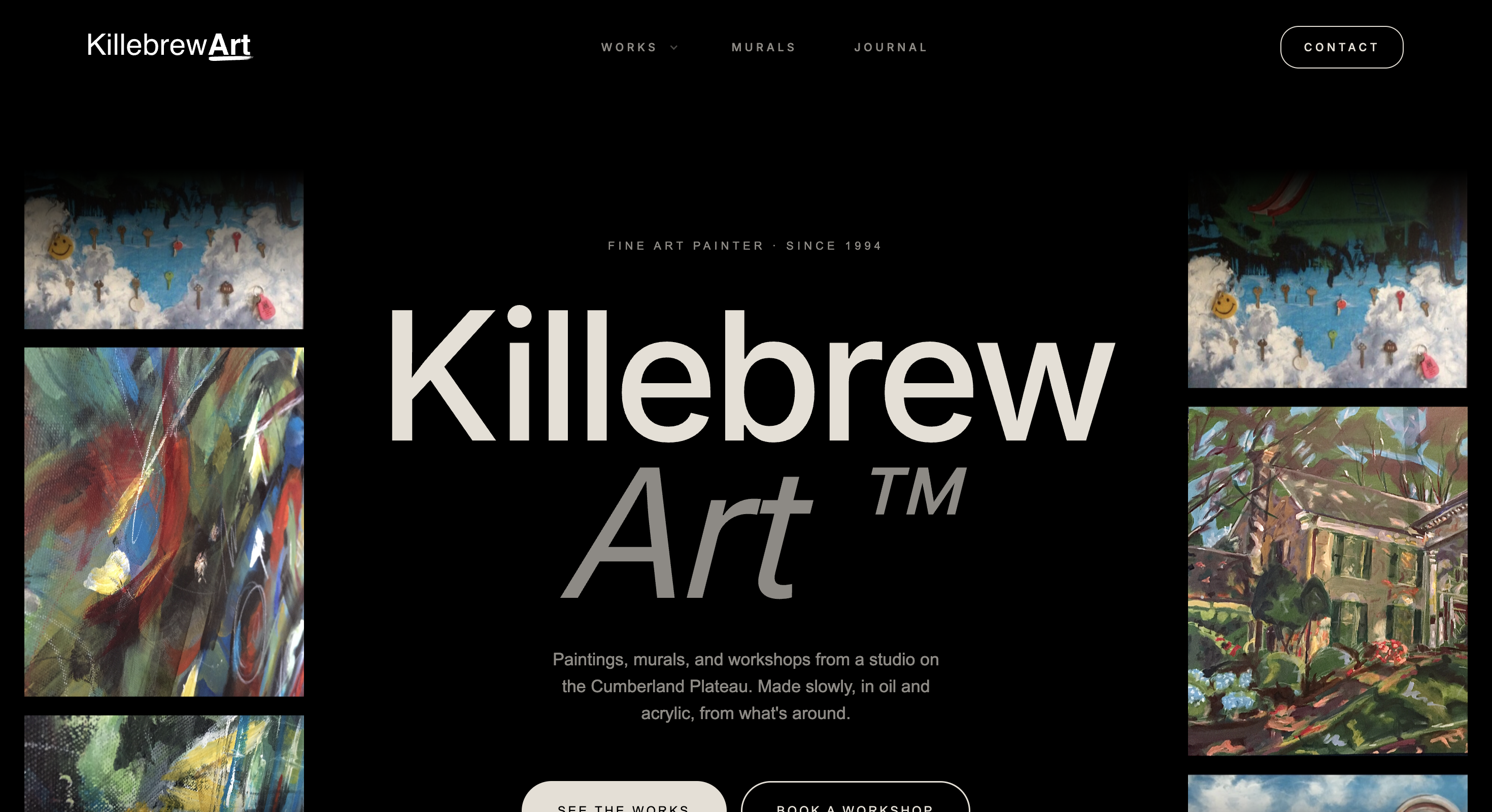
A gallery site is the honest test of restraint, because every decorative flourish you add competes directly with the paintings. The discipline it teaches transfers everywhere: a services page is also a gallery, and your case studies are also the work.
2. Systematised, not improvised
The wobble that visitors sense but cannot name is usually the absence of a system. Spacing invented per section. A button styled slightly differently on every page. Six greys where two would do. Each individual decision is defensible; the accumulation reads as carelessness.
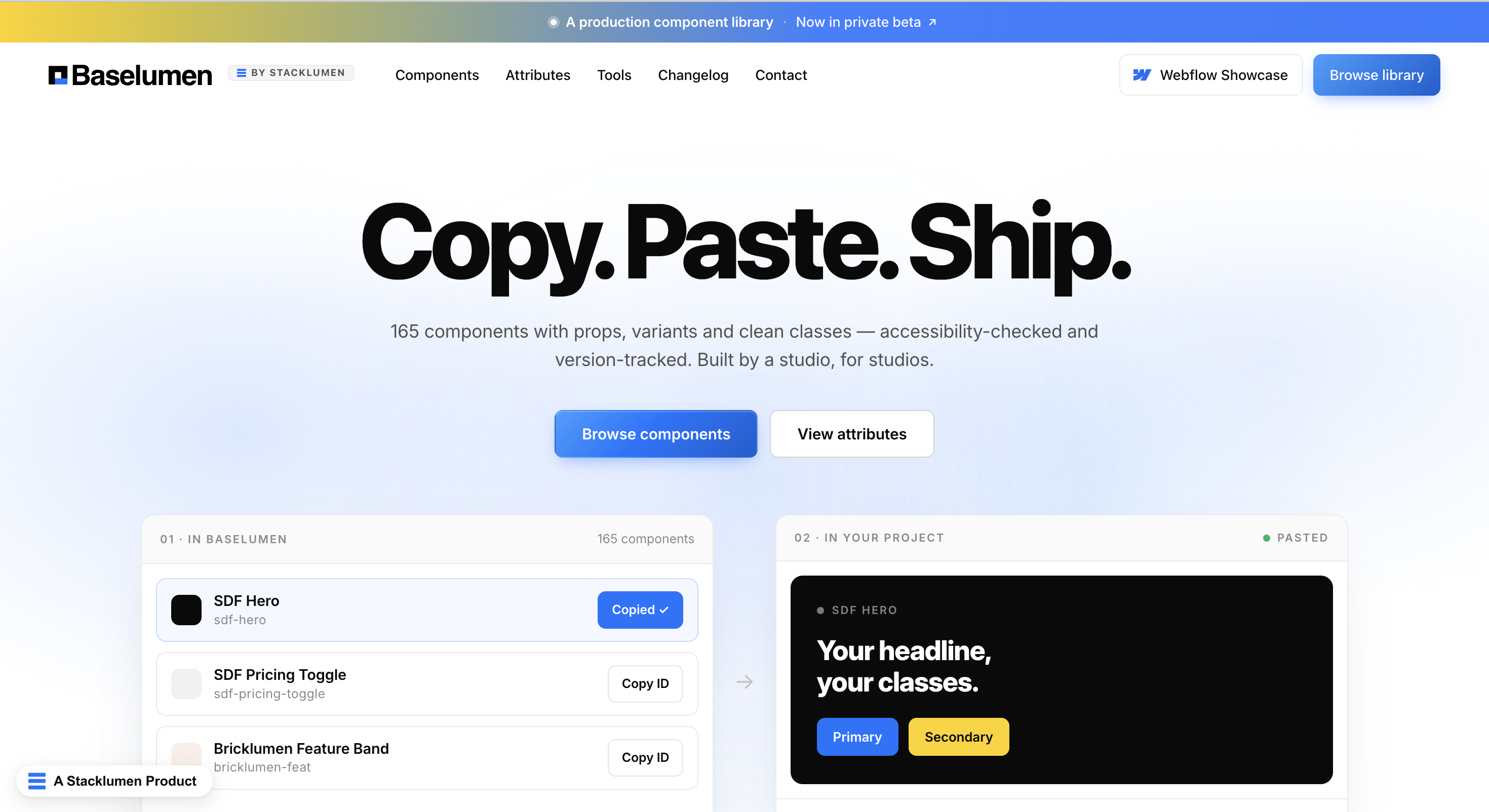
This is why design systems exist, and why they are worth the setup cost even on a five-page site. A defined type scale, a spacing ramp, and one canonical button are not bureaucracy. They are the mechanism by which page fourteen looks as considered as the homepage — including the pages you have not written yet.
3. Structure that survives growth
Most sites look good on launch day. The question is what happens after two years of a marketing team adding things.
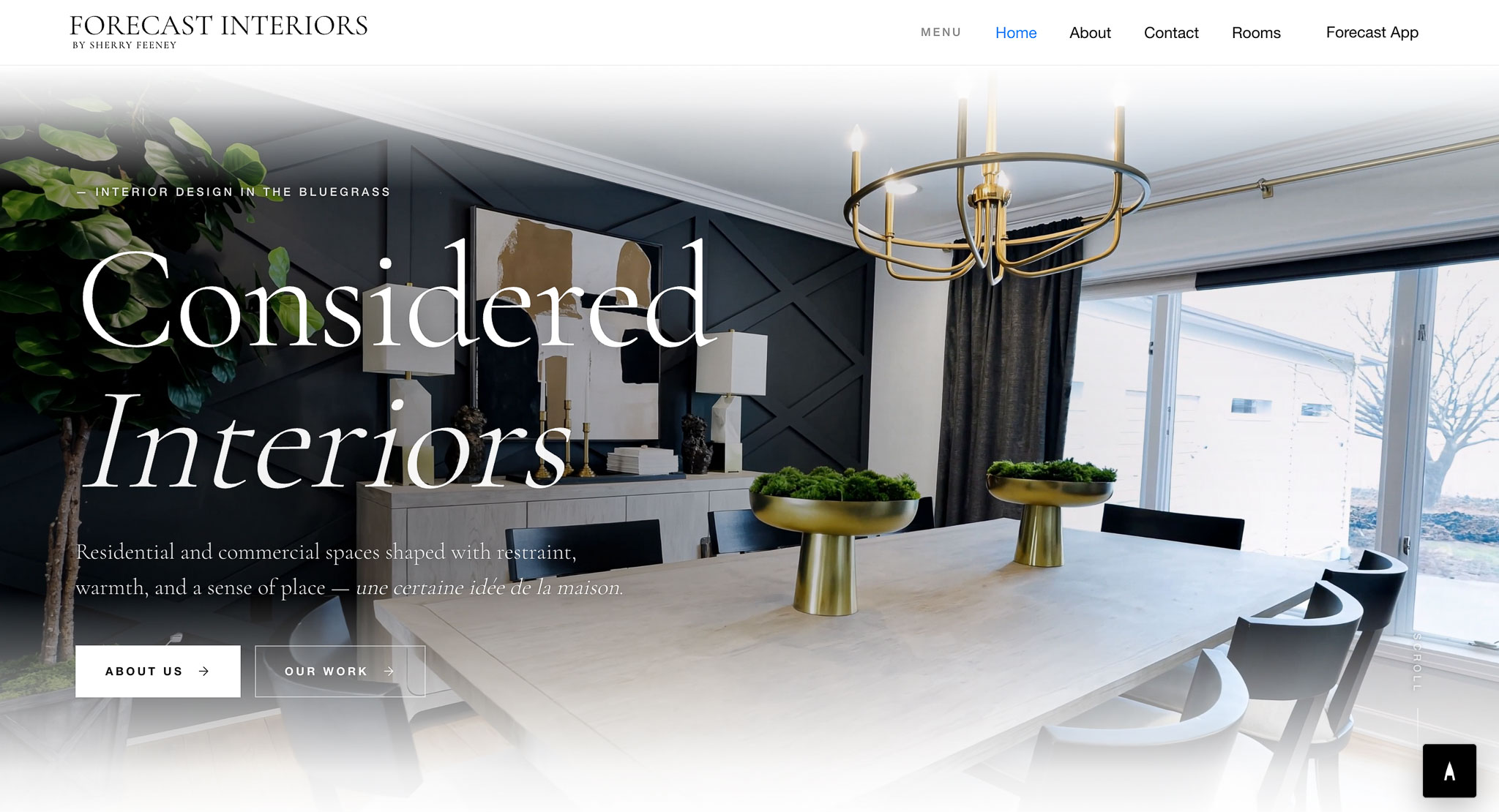
The difference between a site that ages well and one that degrades is almost entirely whether content was modelled properly at the start. If every project is a hand-built page, quality decays as volume grows, because nobody has ninety minutes to hand-build the sixtieth entry. If projects are structured records rendered through one well-made template, quality is enforced by the system.
4. Fast and accessible by construction
These are usually filed under compliance and performance. They belong in a conversation about trust, because users experience them as basic competence.
Deloitte's study of 30 million user sessions across 37 brands found that a 0.1 second improvement in mobile load time produced an 8.4% increase in retail conversions and a 9.2% increase in average order value; travel conversions rose 10.1%, and lead-generation pages saw bounce rates improve by 8.3%.4 One tenth of one second.
Accessibility tells the same story from the other direction. The 2026 WebAIM Million analysis of the top one million home pages found detectable WCAG failures on 95.9% of them — an average of 56.1 errors per page, and a reversal of several years of gradual improvement. Low-contrast text alone appeared on 83.9% of pages.5
Low-contrast text is not a compliance abstraction. It is text a portion of your visitors cannot comfortably read, on the page where you explain what you charge.
The web is getting less clean, not more
The same WebAIM analysis contains a statistic that deserves more attention than it gets: the average home page grew from 1,173 elements in early 2024 to 1,437 in early 2026 — a 22.5% increase in a single year.
Pages are accumulating complexity faster than teams can manage it. Every additional tracking script, embedded widget, chat bubble, consent banner, and pop-up is another element, another request, another opportunity for the layout to shift under someone's thumb. Six recurring error types account for 96% of all accessibility failures, and have done for seven consecutive years — which tells you these are not hard problems. They are unowned ones.
This is the real opportunity. When the median is deteriorating, ordinary competence reads as excellence. A site that loads quickly, has readable contrast, uses one button style, and is built on a content model that will not collapse in year three is not exotic engineering. It is simply above a median that is falling.
What it actually buys you
Put the pieces together and the commercial case is fairly direct.
A visitor forms a stable impression in 50 milliseconds, driven by coherence they cannot articulate. That impression determines whether they reject you outright — the stage where design does its only real persuasive work. If you survive it, your content and specificity determine whether they commit. Along the way, a tenth of a second of load time moves conversion by 8%, and a contrast ratio determines whether a slice of your audience can read the offer at all.
None of this is aesthetic preference. It is the accumulated finding of twenty years of research into how people decide whom to believe on the internet, and it points at the same conclusion from every direction: the structural quality of a site is legible to people who could not name a single thing about it.
Clean is not a look. It is what integrity looks like when it is rendered in a browser.
References
- Lindgaard, G., Fernandes, G., Dudek, C., & Brown, J. (2006). Attention web designers: You have 50 milliseconds to make a good first impression! Behaviour & Information Technology, 25(2), 115–126. https://www.tandfonline.com/doi/abs/10.1080/01449290500330448
- Fogg, B. J., Soohoo, C., Danielson, D. R., Marable, L., Stanford, J., & Tauber, E. R. (2003). How do users evaluate the credibility of web sites? A study with over 2,500 participants. Proceedings of the 2003 Conference on Designing for User Experiences (DUX '03). https://dl.acm.org/doi/10.1145/997078.997097
- Sillence, E., Briggs, P., Fishwick, L., & Harris, P. (2004). Trust and mistrust of online health sites. Proceedings of CHI 2004, Vienna, Austria. https://eprints.whiterose.ac.uk/9909/
- Deloitte Digital & Google (2020). Milliseconds Make Millions: A study on how improvements in mobile site speed positively affect a brand's bottom line. https://www.thinkwithgoogle.com/_qs/documents/9757/Milliseconds_Make_Millions_report_hQYAbZJ.pdf
- WebAIM (2026). The WebAIM Million: An annual accessibility analysis of the top 1,000,000 home pages. Utah State University. https://webaim.org/projects/million/